Ah the contact form.
The traditional darling of digital design assets for any red-blooded, lead-building business. Get an email, get a number and you’ve got a lead in the door. That’s how it’s suppose to work, anyway.
But contact forms, well, meh. Conversion rates are limping along in 2018:
- One 2015 statistic shows that “contact us” forms receive a dismal 1% conversion rate.
- In 2018, as opposed to the early 2000s, consumers are more sophisticated. They’ve been primed to expect low serviceability after filling out a form–that it goes into an abyss, only to start another email or phone conversation to get what they need.
- The majority of businesses still provide a form, but they straddle lead-building strategies across channels to compensate for poor conversion.
How else do you replace the last leg of the digital lead funnel and build your contact list along with it? Businesses scour the internet for the millions of Google results about design, contact form best practices and field requirements to find that perfect ratio between value offered to contact information requested.
Now, along comes conversational UI and suddenly, businesses have a novel approach to gaining leads. Just because it’s new(ish), and slick(er), is a conversational contact form better? Read on to find out how interactive conversational forms can substantially increase conversion rates.
Best Contact Form Practices in 2018
First, here’s a general bullet point list of the best practices every business should consider for their contact form in 2018:
- The number of fields required must clearly support the purpose. A visitor will willingly give more information, from phone to email, if they are either considering or deciding on your product or service. But if you’re casting your rod for awareness, keep it streamlined to a name and email contact field.
- Design is crucial. In fact, that static contact form you have gathering dust on your site may just need a good designers eye for placement, color and scannability to increase your conversion success. Ensure eye-scannability is up to par, alignment is correct, do away with “hint text,” or text within the field, and make sure fields are in the correct order.
- Color choice matters–a whole lot. In the last few years, color psychology provides invaluable data about how colors impact UX. CTAs fare better with primary colors, and blues tend to create trust.
- A/B testing is alive and well. Use these practices and then test what works on your own site, giving it the time and attention it deserves if it’s one of your important lead-building tools.
Many of theses practices apply to conversational forms, too: color choice, design and scanability, conversation lines as opposed to fields and even A/B testing are also a part of what goes into conversational design.
Conversational Contact Forms for Better Conversion
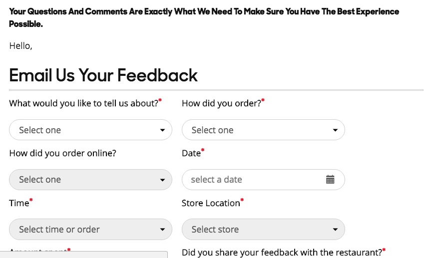
Let’s look at how replacing your contact form can really make a difference in your conversion rate. Take a look at this static contact form, compared to a conversational approach.
In the static form, it’s clear the business is driving the conversation by the field types that are mandatory, though this is the screen a user lands on if they want to contact the company in general. You can see, if, say, you needed to resolve a quick question or it’s not addressed in this form, you’d be jumping this contact hurdle to get the help you need.

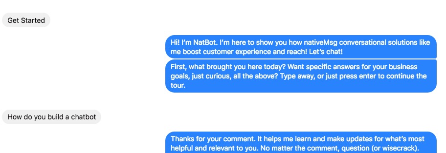
Here’s a look at how nativeMsg has used a conversational approach:

First, no one has had to wait on hold or press a few buttons to be able to say what she needs. Instead, a user can easily state their need or question to get the information much faster.
You can create this kind of contact form and include a request for email or create a hybrid contact form–one where a representative steps in to nurture the conversation. This users intent is direct and obvious, so it’s easy to know how to serve it. These conversations can and do result in contact information and opening the door to further conversations.
Start with Interactivity: The New Experience
Interactivity can mean anything from a scroll experience within the drop down field to conversational AI, or chatbot, contact form. But most businesses will fare better by adding a level of interactivity to their contact form. First, interactivity re-sets consumer expectation-that immediacy is a value and part of your businesses service. Interactive forms ease user mental output and up clarity. Interactivity means you won’t see those confusing asteriks. Every field is necessary and every field is clear.
Not ready to jump into conversational contact forms? Start with an interactive update and use this format to segway into a conversational form.
Then, Focus on the Mobile Space
Gartner predicts that in a few years’ time, 30% of users will have contact experiences that are voice assistant based. Get started now and start with mobile, where a conversational experience is fitting for the design functionality. That’s especially true in a B2C context where conversational commerce is gaining momentum.
Millennials are also expecting ease in this arena and are much more likely to enjoy and adopt the experience, particularly on mobile. It’s personalized, creates faster results, and allows for more input than, say, a wider static form field does.
Chatbots and Conversational AI Create Enormous Conversion
Here’s the secret: conversational UI, when designed well, create enormous engagement and conversion. Engagement is strikingly higher and conversion rates follow suit. Use cases show rates across the board that are higher: 30% and 72% conversion rates in a few case studies. One recent study garnered 300% conversion rates for chatbot implementation (on the whole, not only as a contact form) and 100% better user engagement. What’s more, you can build the contact experience directly into the chatbot experience.
Build the contact form directly into the chatbot experience.
Conversational AI draws in your visitors with personalized interaction. It’s also an easier leading building tool couched within a conversation, as you see here, and it can deter visitors from bouncing.
Instead of static forms, a conversational experience guides visitors to more easily share information. It also provides signals for better insight into a visitor’s intent. The average chatbot conversation is 20+ lines of text. That’s much higher engagement than static fields in a contact form. It’s also a more natural approach to gleaning whether a visitor is building on awareness or is in a consideration and the decision stage of the buyer journey, as in these examples, here:


Want to get started quickly? Embed an onsite chatbot with a contact option and continue to maintain a static contact form for your site (a strategy used here that creates helpful insights). You’ll see how much interaction occurs, even with a simple conversational solution.

