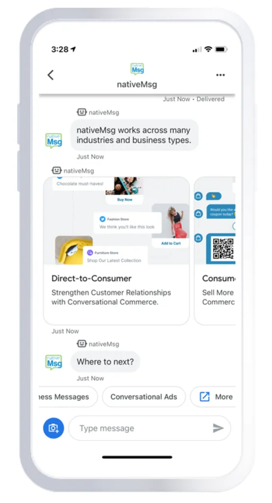
We have received a lot of great feedback regarding our own Google's Business Message experience. In the grand scheme of things, messaging is a newer channel of communication especially for businesses and there is still a lot to learn. Most messaging or chat experiences are related to customer care - your bottom right corner chat to speak with a representative. Although, this has been changing over the last couple years and moving to a more comprehensive experience letting you choose your own path.
Discoverability has always been an issue for most businesses when it comes to messaging. How do I get a potential customer to find me and start a conversation? Google has done a great job solving this problem by baking the Messages or Chat icon into various places inside organic search results. Did you know 92% of searches happen on Google?
Once a potential user has found you and wants to have a conversation, what is the best experience to design for them? This is where the rubber meets the road to guide them through your brand and surface the most compelling information. There are books and books on how to create great sales and marketing websites and landing pages, but driving someone from search to a one-to-one conversational marketing experience with no website as reference (bottom right chat) is uncharted territory.
These are the goals we set when we created our Google's Business Messages experience:
- Provide solutions and use cases that are applicable to our intended audience.
- Use the channel to educate and demonstrate what is possible.
- Create journeys to answer questions in the least amount of steps.
- Always provide a path forward.
- Provide easy paths to contact us.
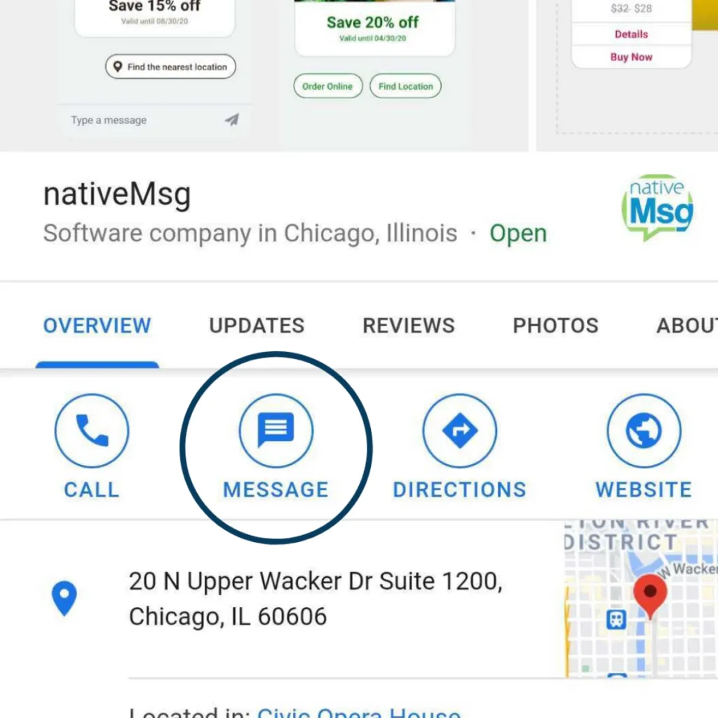
The 6 strategies we used to meet our goals:
1. Narrow down why a user is there into 4-5 reasons
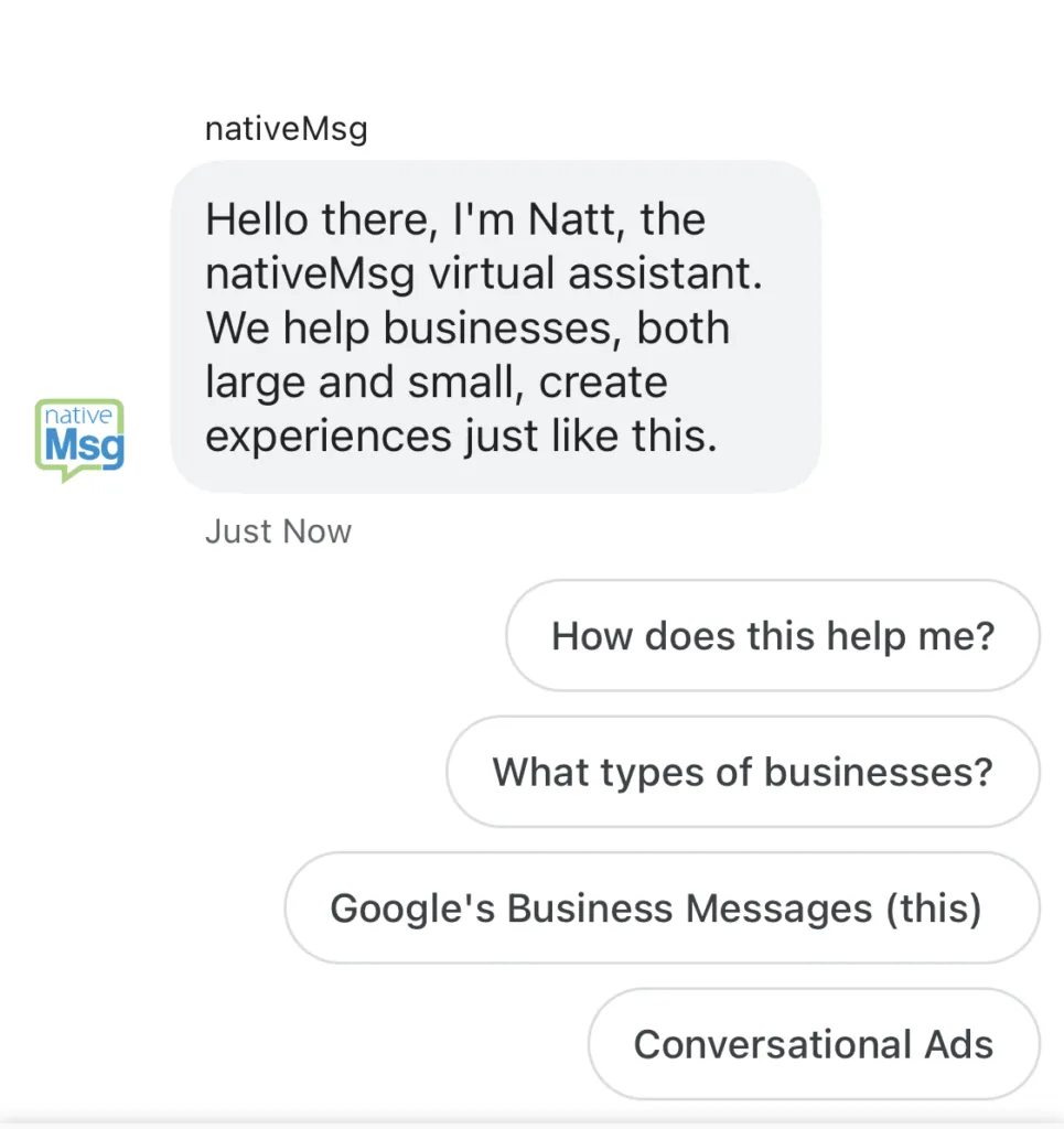
They say a good trial lawyer always knows the answer to question before they ask it. The same applies to good user experiences as well. Knowing why a user is interacting with your brand and providing the prompts to get them down the proper path is key to a good experience. Depending on the size and offering of your company, there may be a number of reasons someone has chosen to have a conversation with your brand. Through various internal research and inbound paths, you should be able to identify the 4-5 main reasons a user engages your brand. Being a step ahead of the user and prompting them with buttons to address those needs creates an instant connection and assures them you speak the same language.
2. Imagery vs Text
"A picture is worth a thousand words" is an understatement. It takes the brain 13 milliseconds to identify an image. Can you read a thousand words in 13 milliseconds?
The use of imagery in messaging channels exponentially speeds up the communication process and elevates the experience and the recall rate. You have seen this natural progression in texting with the use of emojis and animated gifs. It is much easier to get your point across with an image than long text. This concept holds true in messaging channels as no one wants to read long bubbles of text. In addition, imagery provides an increased branded experience that you wouldn't get from text.
3. The Use of Carousels
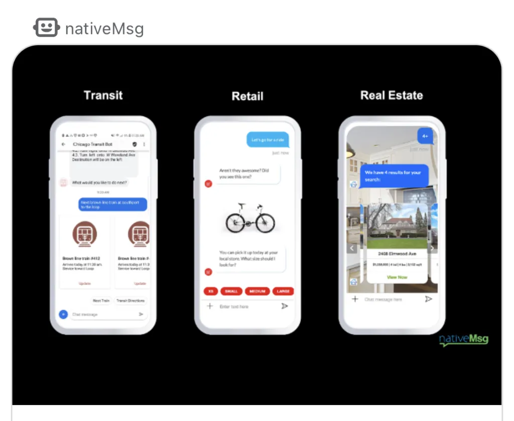
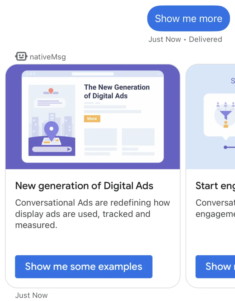
Carousels are a more popular display element over the last few years thanks to messaging channels, display advertisements and mobile apps. The ability to present a list of rich media content that can be hidden and horizontally scrolled is ingenious. The horizontal interactivity of a carousel message in a vertical scrollable world is a nice reprieve. It's like a cheat code escaping into a secret world of content. Carousel messages can present various types of content in a more digestible fashion. They are very useful to list:
- products with title, image, description, price, learn more and buy buttons
- navigation items with an image, description and link
- news content with an image, excerpt and a button to read the entire story
- pricing tiers showing the price, description and a sign-up now button
- image galleries with a brief description
The carousel design element is the most effective tool in today's messaging world. Use it with grace and style and watch your engagement soar.
4. Shortest Path to Resolution
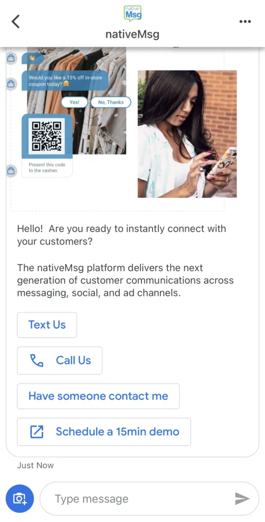
The days of sending 8 text messages back-and-forth to finally get your answer are long gone. With the use of more sophisticated message types and known use cases, you can get your user from point A to point B in the least amount of steps. The number one customer satisfaction request is, "I want to solve my problem quickly." By providing predefined responses and buttons, you can provide a guided path to resolution for your user. Win over your customer by providing a great user experience and they will love you for life.
5. Always Provide a Path Forward
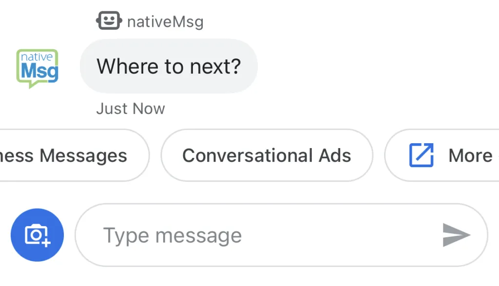
The most frustrating part of a messaging experience is when I don't know what to do next. The best way to get someone from point A to point B is by them choosing their own adventure, not asking the all-knowning free form text box a question or command. Do your users a favor and provide them options and hints as far as what to do next - lead the horse to water. Always having an option or button to do more will increase engagement and create a deeper branded experience for that user. Menus exist in all applications for a reason. For now, this is the closest thing to menu navigation the we have to work with.
Even with channels like SMS that do not support buttons, ask the user to text Option1 or Option2 in response. This will increase ongoing dialogue.
6. Text in Short Bites
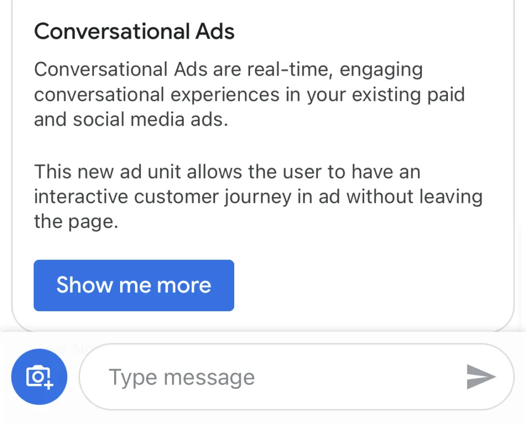
People obviously prefer short bitesized pieces of text. This has been a common theme over the last 10 years starting with Twitter and text messaging and continuing into every messaging channel. Keep text bubbles short - 1 to 2 sentences - and use multiple text bubbles vs. long form text bubbles when you need to convey a concept in a long text format. Communicate with people how you want to receive communication.
Designing these new user experiences to be successful doesn't take a lot if you follow some very simple rules for the channel. Your users will thank you and should respond with engagement. To try the nativeMsg Google's Business Messages experience, search nativeMsg in Google and click the Messages icon or use this link.

