By now, you’ve probably seen many articles about the advantages (and disadvantages) of chatbots. You’ve probably also interacted with a chatbot along the way. The fact is, we’re standing on the precipice of a new kind of customer experience when it comes to messaging applications and messaging as an interface.
Facebook Messenger has been the ground zero for businesses and users to create chatbot experiences with their messaging interface. Facebook has been guiding the story––as in, come along to Messenger and have a full online experience within its messaging space.
The Future: Messaging as a Platform and Messaging as an Application
But, to be sure, chatbots, and Facebook’s pioneering agenda in 2016 and 2017, are just the beginning of what’s to come. More and more customers will opt to interact with businesses in messaging channels, across channels.
This guide is for what’s current and what’s coming. In 2018, chatbots and messaging as an application (MaaA) will continue to grow across industries. All signs head in this direction, meaning, you probably should, too.
Messaging is fast becoming the new space for cutting edge development where messaging is the new platform for online interaction and messaging is the new application, or simply, MaaP and MaaA.
But businesses are continuing to learn and to understand: What is a chatbot in Messenger and how do chatbots work-really? What components make-up a Messenger chatbot?
If you’re thinking about integrating a chatbot on Facebook Messenger, diving into the details of what you can achieve might feel tedious, but it’s essential to creating a fluid and effective customer experience.
We’ve created this guide with you in mind, for non-developers who want to learn how each part works, to help you understand how you can develop and use a chatbot for your organization.
We’ve included use-case examples, customer experience tips and step-by-step visuals so you can apply it to your organization’s goals.
Here’s our in-depth guide on chatbot terms and elements for a Messenger chatbot and how each part works together.
First, Can Anyone (Meaning, You) Build a Chatbot on Facebook Messenger?
Yes. You can…sort of.
On the outset, Facebook provides 5 steps that seem simple enough to take:
1.Learn about Messenger.
2.Try a Sample Bot.
3.Set up your Webhook.
4.Set up your Facebook app.
5.Build your first Bot.
If we’ve lost you at “webhooks,” then this article is for you: every online retailer, healthcare, insurance or finance manager, basically, every organization that is planning to implement a conversational component into their customer service, and wants to get started.
To build on Facebook Messenger, you do need to know about coding and that it’s not as easy a builder interface, but more so, a manual of tutorials to help you through, which is only fun for, well, no one (sorry Facebook ).
Rather, Facebook provides all the features and you put them together via code to make a chatbot.
Pro Tip-
While there’s many organizations out there to help you build, choose a service that develops your chatbot so that the underlying architecture will serve for future iterations and won’t limit the functionality to what’s available today. How to know this?
- Is the service based on Natural Language Processing (NLP)? Will your chatbot fundamentally train data––well and accurately––to build on customer info and to offer continued personalization and intuitive experience?
- Can you use the underlying api across channels, once you’ve built an excellent chatbot experience on Facebook?
- Can you continue to develop upon the conversational application within Messenger as a new portal to other useful applications as your customer engagement and usage grows, or will you be limited to a simple chatbot application?
A developer or bot maker platform can work in the short-term to create a simple query-based chatbot, but advanced solutions and even simple well-built ones, which are fast becoming a part of the customer service and commerce landscape, will allow your business to better grow vertically to where your customers are.
These are the basic steps and components Facebook Messenger provides to create a conversation and user experience:
Basic Components of a Chatbot for Facebook Messenger:
- Welcome Screen
- Introduction, Greeting Text
- Get started or Menu
- Persistent Menu
- Buttons
- Messaging and Pre-Built Templates Options
Let’s address the basic, granular content components, first.
To start, there are multiple content types that you can use, at every step of the conversation flow (or interaction). You can enhance the overall experience by providing images, videos, audio files, plain text or a file attachment, and it’s simple to include most any of these in most steps or flow:
- Text -character limits can vary for each element.
- Audio – Audio files can be uploaded or the URL can be used.
- Image – Image files can be uploaded or the URL can be used. jpg, png and gif (below 75 frames) supported.
- Video – Video files can be uploaded or the URL can be used.
- File – Files can be uploaded or the URL can be used.
Users Can Upload Information within the Messenger Chatbot Experience:
The possibilities here are super cool. Have a plumbing problem, and want a very quick response or quote? Upload a video to your local plumbing service to show the problem—and get a quick answer for how to solve it, or a quote, to save you time and money.
Also, What’s a Webhook, You Say?
A webhook is a coding function (and why, again, working with knowledgeable pros ensures a better experience). There are different types of webhooks and Facebook Messenger uses “event webhooks.” It’s a code-specific way to send and respond to notifications. For instance, a customer checks out, your webhook is notified and can update checkout pricing with your customer’s address to include shipping.
Facebook is a strict school marm about the way organization’s respond to a webhook callbacks within the code, with a specific code response. If you haven’t constructed each response correctly, your registered webhook may be unsubscribed. It’s to ensure that Messenger experiences all have similar, sound responsiveness.
If you’re still eager to build on your own, to find out more about webhooks, we like this recent explainer piece by ChargeBee.
Now that the “fun” stuff is addressed, here’s step-by-step of all chatbot components in Messenger:
1. The Welcome Screen: Use Visuals that Work in the Limited Space
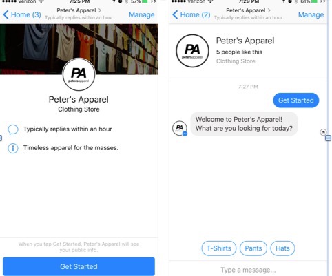
Just like chat experiences you’re already familiar with, a chat welcome screen pops up, complete with a name, profile and cover images and description, which are pulled from your company page.
But unlike live chat, this welcome screen can pop up, or not, in a less obtrusive way. Meaning that, you’re not bombarded by a greeting window that blocks what you’re trying to do on-page. Instead, it’s meant to be its own navigation menu and space within the space.
Customer Experience tip:
The welcome screen can provide customers information on when they can expect to receive a response. When you’ve integrated a chatbot, new visitors will see that “responds instantly” responsiveness rating more quickly. It’s an easy way to quickly convey a great experience from the start. Also, consider how a cover image translates within the smaller space and consider an update if it’s too busy.
2. Create Greeting Text That Clearly Explains Your Chatbot’s Service
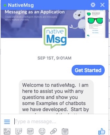
You have 160 characters in greeting text to convey your bot’s purpose and to set your customer expectations by how you craft this copy.
Once the greeting text is setup, it will override the description that was pulled from your Facebook company page. Changing this text is important for a few reasons: to extend the brand tone and messaging and to begin guiding your visitor toward how your chatbot can serve them.
The greeting text isn’t the same as the first message, or conversation. The first message comes right after a visitor engages and as the first conversational text—or media. Your greeting text adds increased specificity to direct and set visitor expectations.
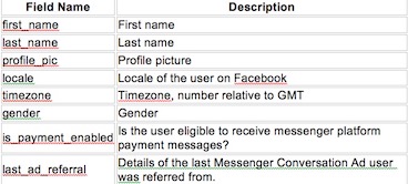
User Fields to Select for Your Chatbot Greeting
When using Messenger, certain data is passed to the chatbot from the user. Messenger currently supports the below information:
Customer Experience Tip:
You can personalize the greeting text on the welcome screen with a visitor’s name. Depending on your bot’s purpose and the type of business you run, a first name basis can be off-putting for a new visitor. A law firm inquiry may do well to engage with a last name greeting, and that’s likewise the case for complaint inquiries where a chatbot fields the first question.
Keep your brand and business tone in mind and opt for a more professional greeting using their last name if it makes more sense.
3.To Engage: Get Started or Type a Message
The welcome screen can be configured with a “Get Started” button to let your visitor know how to start the conversation with your chatbot. Once they’ve clicked the get started button, the conversation with your Facebook Messenger chatbot begins.
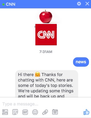
Or, you can also opt to allow your visitor to type a message like CNN has, or even keep this “composition disabled” throughout the experience, so you’re completely guiding the experience with pre-built features. Direct what the first engagement is within your greeting or with a button.
Customer Experience Tip:
Throughout the conversation, always ensure your visitor never has to guess what to do next to get the information they need. Give explicit options based upon the service your Messenger chatbot provides. You can include bubbles, buttons, quick replies text, images, audio, video or a file. Being slick isn’t as important as specificity. Use the medium that best works for directions. Short video is excellent for showing how to get started with a product, but is extraneous if you’re searching for a product.
4. The Persistent Menu Guides Your Main Objectives
Facebook rolled out an update in the summer of 2017 so that developers had more flexibility in functionality with the addition of buttons. This menu is always accessible and is located in the left corner of the screen as a “hamburger” icon drop down.
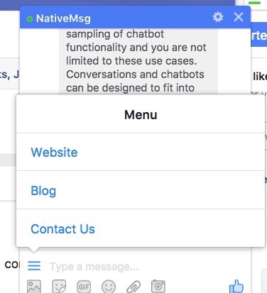
It provides your visitor with the general functions and information a visitor can find, much like a navigation window on a website, and where you can add visuals or graphics, too.
This menu can have up to 3 items on the top list or level, and up to 5 items for calls to action and options within each of these. Each item is limited to 30 characters. Persistent menus can also specify a specific locale with over 100 supported by Messenger.
Customer Experience Tip:
If you’re wondering, how, exactly, is this unique from a typical site experience, in some sense, it isn’t––for now. Though it stands to be, and that, alongside the traffic opportunities makes this current functionality an important potential point for your business.
What differentiates your customer’s experience here is how well you use the functionality toward the objective’s end. And with recent updates, interaction flows become more dynamic and will continue in this direction. For example, your visitors can open a third-party link––an extension–– within the messaging space, so if they’re searching flights, the next menu might provide car rental suggestions for an experience all within the space.
5. Buttons Guide Customers Toward Specific Actions
Buttons are available for anything from sharing, linking to an outside URL, making a purchase or as a contact button.
A note about purchases:
Facebook currently has payment transaction ability in beta for a one-step “Buy” button with a connected Stripe and PayPal, as well a one-time-use “tokenized” Discover card to process the payment. There are a few other ways, and this way is U.S.-based only right now. Otherwise, it’s a two-step process.
You can add these buttons to your messaging at each point in the form of messaging templates.
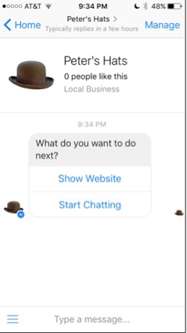
The image is the generic template with buttons. Buttons are the elements that are part of the bubble (just below the bubble, like in the image) in a chatbot that allows the customer to pick the next step in their chatbot experience. There is a maximum of 3 buttons per bubble. Buttons can have many functions including:
- 20 Characters
- Opening a URL
- Making a postback to your webhook
- Calling a phone number
- Opening a share dialog in Messenger
- Opening a payment dialog in Messenger
- Ability to log in and log out of external accounts (Account Linking) to provide a more secure, personalized and relevant experience for the user.
Different buttons are better suited for different experiences and flows:
Quick Reply Buttons Are Helpful for a Simple Ask
Quick replies are another way to allow the user to choose the next option in their Messenger chatbot journey.
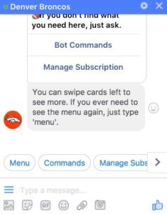
A quick reply is a button presented in response to a message. Quick replies can include up to 11 choices to a query and once a choice is selected, the others disappear. Quick replies can contain text and an optional image. A quick reply can have:
- Up to 20 characteres.
- Images should be 24×24 resolution.
- Can contain up to 11 quick replies per instance.
Customer Experience Tip:
You can use this for a simple ask, if a customer is creating an appointment time and they want to choose from a few different times, as in morning, afternoon or evening, let’s say. But a series of quick replies should really be used for simple-step queries, like appointment timing, product sizing (like below) or color selections, and can dumb-down a richer experience if used as the main exchange in the experience.
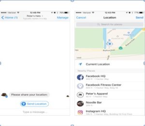
Another feature of quick replies is that they can be used to get location information, which your customers can then see displayed on a map in Messenger as in the example below.
Open a Site Within Messenger: Webview Allows for Richer Interaction and Deeper Context
Webview isn’t technically a button, but a way to access a site-like experience within Messenger. It probably deserves a little more read time when referring to the structure, as it’s a space to, let’s say, dive deeper and create more interactive engagement.
Frankly, it’s one of the more exciting features of Facebook Messenger chatbot development. Webview allows for graphical user interface (GUI) experience, meaning customers can select tickets in a stadium seating chart, for example, or select items based on personalized information intuited within the design here, like in this example.
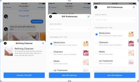
You can be extremely detailed in your interactions, with opportunities to change previous information a customer entered, choose more than one item on a list or provide a longer list.
Customer Experience Tip:
Create an experience that remains within the space and avoid, where possible, leading your customer outside of Facebook Messenger.
Always be guiding. Let a customer know when a dialogue box is coming; it can be confusing given that the Messenger chatbot platform is a new way of navigating apart from a website or app.
Keep in mind, a lot is happening on Facebook. For your customer, it’s akin to stopping into a store in a brick and mortar mall––there’s a similar sensory stimulation to take into consideration.
6.Template Options: Choose Wisely from Messaging Options
There are structured messaging options (generic templates) and other specific-use templates, all with text, emojis, audio or text files.
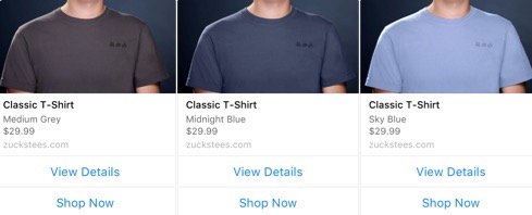
Structured messages include a button template, carousel experience with buttons images and subtitles, and a generic template that’s best if you want to begin at a high-level topic where you can use buttons, text and images.
You might use a carousel for a selection of jeans, whereas a general message is great at the start of a shopping experience, to find out more about what a customer wants to purchase or sizing, for example.
Customer Experience Tip:
This is where a Facebook Messenger Chatbot experience can go south if not executed well. If you always keep in mind that your chatbot functions as a customer service agent or sales associate, whose job it is to lead a customer to what they want, based on what they’ve answered, you’ll be less likely to create a non-sequitar experience by which tool you select to move that experience to the next, logical step. Don’t open a flow to text response if that response is going to create confusion for the next flow step. A customer can type in “look for hotels in San Francisco” fairly easily. But if they’re searching for health insurance based on specific family needs, start with high-level info gathering to keep the experience coherent.
Messenger has quite a few pre-built structured templates to assist in building out your chatbots to build a seamless customer experience.
We’ve covered buttons, but the main list includes:
- List Template
- Receipt Template
- Open Graph Template
- Generic Template
- Airline Template
List Template
The list template allows you to display items vertically.
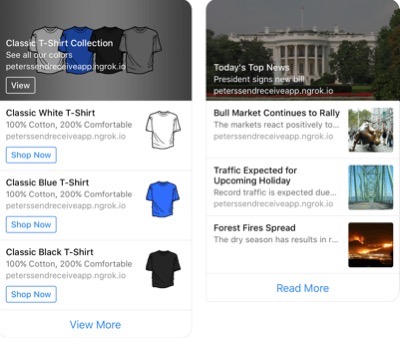
This template allows you to include one button (URL, Postback, call, share and buy) which can prompt the user to purchase an item, share the content in Messenger, make a call, display a URL or provide additional data from a 3rd party source. When a customer clicks on the item, a URL can be opened in the in-app browser to take the user to a landing page or other content. There are two ways to display a list template:
The first list template enables you to highlight one of the options by including an image and text in the header area, at the top of the template, like in the example above. The conversational commerce example (buying t-shirts) and news chatbot (daily news) example can be pulled from an RSS feed or any other accessible data source to display inside of Messenger.
In the second example, each item is displayed identically to the other items in the list. This makes sense when you do not want to highlight one of the items or a specific piece of data.
Each list template message can also have up to 1 global button below the item list (like the “buy” button above).
List templates must have:
- At least two elements but not more than four.
- Buttons are not required but can only be included per element, like you see in the examples above.
- The title can be up to 80 characters but can be truncated if the element takes too many lines.
- The subtitle can be up to 80 characters but can also be truncated if the element takes too many lines.
Likewise, the share button and buy button can only be used with generic templates.
Receipt Template
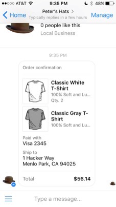
The receipt template is used when making a purchase through the Messenger platform to provide order information. Facebook Messenger allows for developers to include:
- Recipient’s name
- Merchant’s name
- Order number
- Currency type
- Payment method (name of payment method and partial acct number)
- Time of order
- URL of order
- Items (up to 100, title, subtitle, quantity, price, currency & image)
- Shipping address (not required)
- Payment summary (subtotal, shipping cost, tax and total)
Open Graph Template
Open graph templates are interesting. The term is coined by Facebook as a way for social software to be shared across platforms. This template is really only for sharing song files for now. With this template, you can send a structured message, include a URL and one optional button.
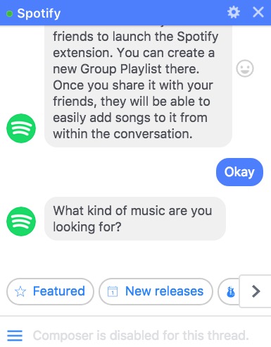
Spotify currently uses it in their chatbot experience as an extension, where users can scroll through a carousel of music genres, make a selection and preview 30 seconds of music in an opened dialogue box. You can like (or dislike) their picks with emojis and create and share playlists directly with your friends on Facebook. Musicians and composers can use it to show an album thumbnail and preview music, or movie scores.
Generic Template
A generic template, again, is simple to include in the beginning and throughout the chat experience. It’s a structured message that provides a title, subtitle, three buttons, and image. The image above shows a carousel of generic templates. Bubbles are the elements that contain text or images and are a place to provide instructions to users, explain what the bot does or provide additional context for selecting buttons or quick replies.
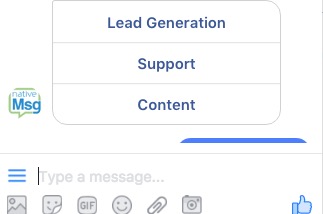
Bubbles do not need to have buttons and can simply be text or an image. Bubbles and buttons also create cards in a carousel that allow customers to horizontally scroll through multiple items. A vertical list can also be created that doesn’t need to be scrolled in order to view all the elements.
- Image and text
- Title (Bold) up to 80 characters
- Subtitle up to 80 characters
- Max of 3 buttons.
Airline Template
Every airline can create a great experience within Facebook Messenger with this template, to make traveling more convenient.
Facebook Messenger provides a template for all parts of air travel:
- Airline Boarding Pass
- Airline Check-in
- Airline Itinerary
- Airline Flight Update
This template seems like a straightforward use case, except when you consider third-party linking. In the case of Absolut Vodka’s first chatbot experience,which we discussed in a previous blog, they partnered with an outside company to create an amazing end-user experience so that at the end of a night, a user could simply click on a button to reserve a ride home. So, not only airlines can use this, but hospitality services may build this in to their chatbot experience as extra, comprehensive service.
Customer Experience Tip:
A luxury boutique hotel in Chicago might link to airline information as a concierge courtesy within their chatbot. A large conference might also include this to better help attendees plan their trips.
Currently, Expedia continues to take travelers outside the Messenging space to book flights and Travelocity has created a hybrid bot to pass your request to a live-agent.
Airline Boarding Pass
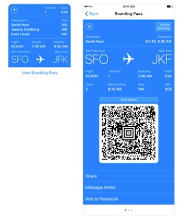
The template is straightforward, building in a similar experience to what travelers currently see when checking in directly with a site. Boarding passes are fairly static, meaning that customers can, at most, select a priority seating option but can’t change much else. However, it is intuitive and will load according to each user’s flight information.
Airline Check-in
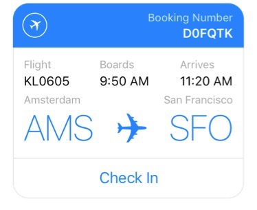
Again, check-in is also straightforward, and common to what travelers see already on-site, with a simple-purpose screen and a confirmation once a traveler has checked-in.
Airline Itinerary
The itinerary allows individualization based on the purchaser’s information . If booked together, the itinerary will show each traveler’s information and you can view details by pressing a button to extend the information.
Airline Flight Update
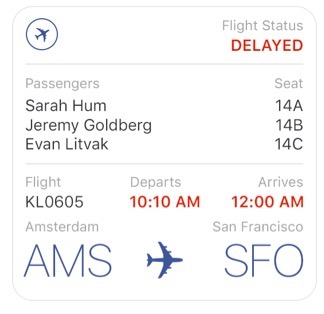
This screen is a notification, sent to all travelers on the participating flight via Facebook Messenger. The notification is sent on delays, gate changes or any change in scheduling, so busy travelers don’t have to take the step to find out.
We hope you have a better sense of what’s available for your origanization, what steps you can take now to get going with a conversational layer and ideas for how to create a conversational experience on Messenger.
You can check back in with us; we’ll keep this guide updated for you, as Facebook continues to make changes to better the experience. It’s clear that while some businesses have hopped fully into creating a chatbot experience, others are still dipping their toes into the space or haven’t caught up just yet. It’s still a frontier, but one that is rapidly being developed and is a crucial part of customer experience going forward.
Free Trial
Get Started With RCS
Business Messaging!
Unlock the power of RCS and revolutionize your customer engagement.


