The Challenge
You're spending millions on channels that don't work
SMS/MMS
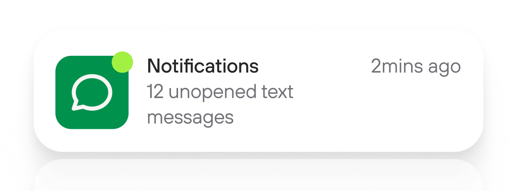
Your messages have no branding, so they look like spam or scams. You can't track who actually engaged or why they ignored it.

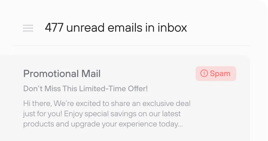
Most of your carefully crafted campaigns land in spam or the promotions tab where customers have been trained to ignore them.

Mobile Apps
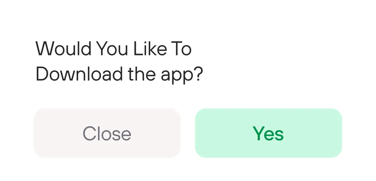
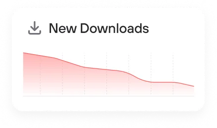
Push notifications get disabled immediately. You're only reaching the 5-10% of your customer base who actually downloaded it in the first place.
Artificial Intelligence (AI)
Your GenAI and agentic workflows are powerful, but they're stuck behind websites customers don't visit and apps they won't download.
Metrics
there is a better way
Send rich, app-like experiences instantly through messages.
Use Cases
Talk with your customers, not at them
Marketing Agencies

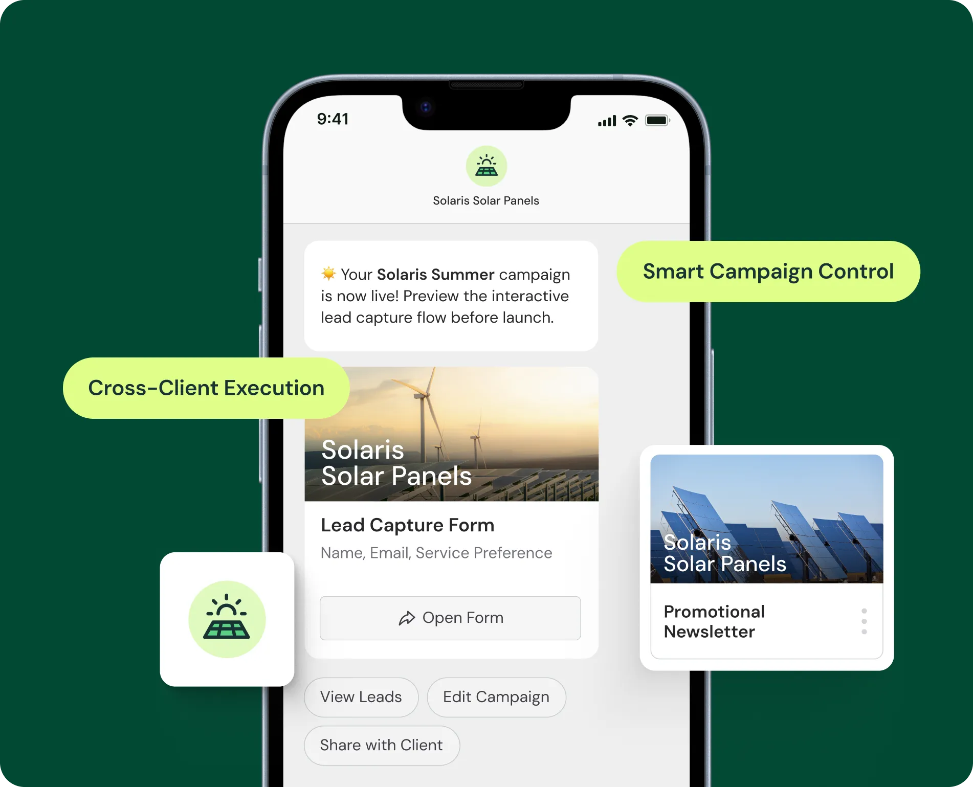
Client Campaign Execution
Launch interactive promotions for multiple clients from one platform

Post-Purchase Upsells
Personalized product recommendations based on purchase history

Back-in-Stock Alerts
Notify customers instantly when waitlisted items become available
Media

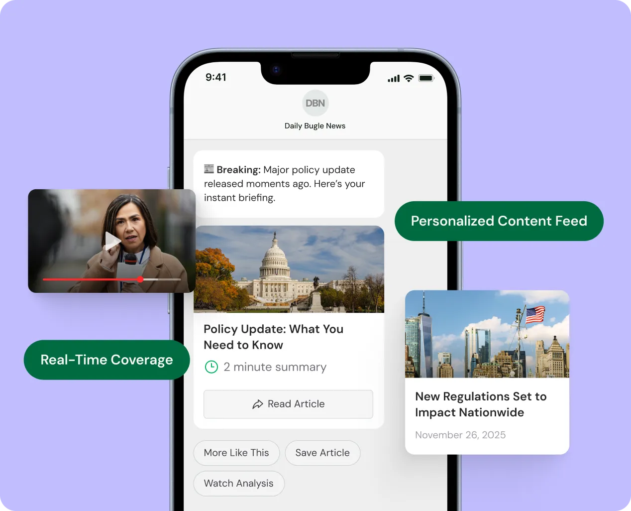
Breaking News Alerts
Rich media notifications with images, videos, and one-tap article access

Content Recommendations
Personalized article suggestions based on reading history

Reader Surveys & Polls
Interactive audience feedback that increases engagement rates
Consumer Packaged Goods

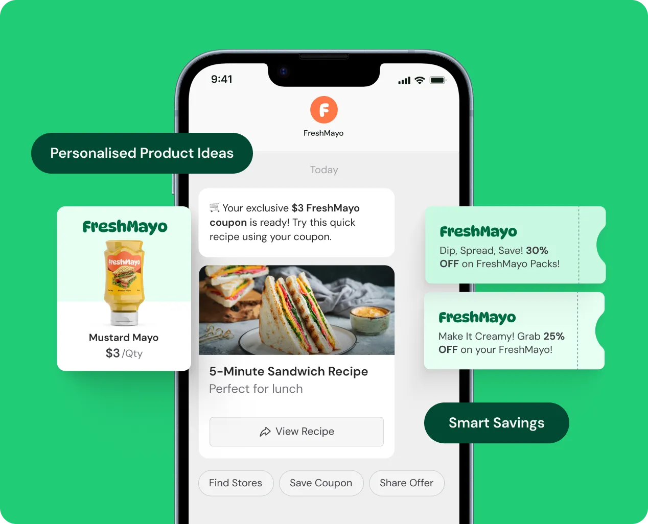
Coupon Distribution
High-value mobile coupons with retailer locators and barcode redemption

Product Sampling Programs
Personalized product recommendations based on purchase history

New Product Launches
Where-to-buy information with store locators and availability alerts
Sports

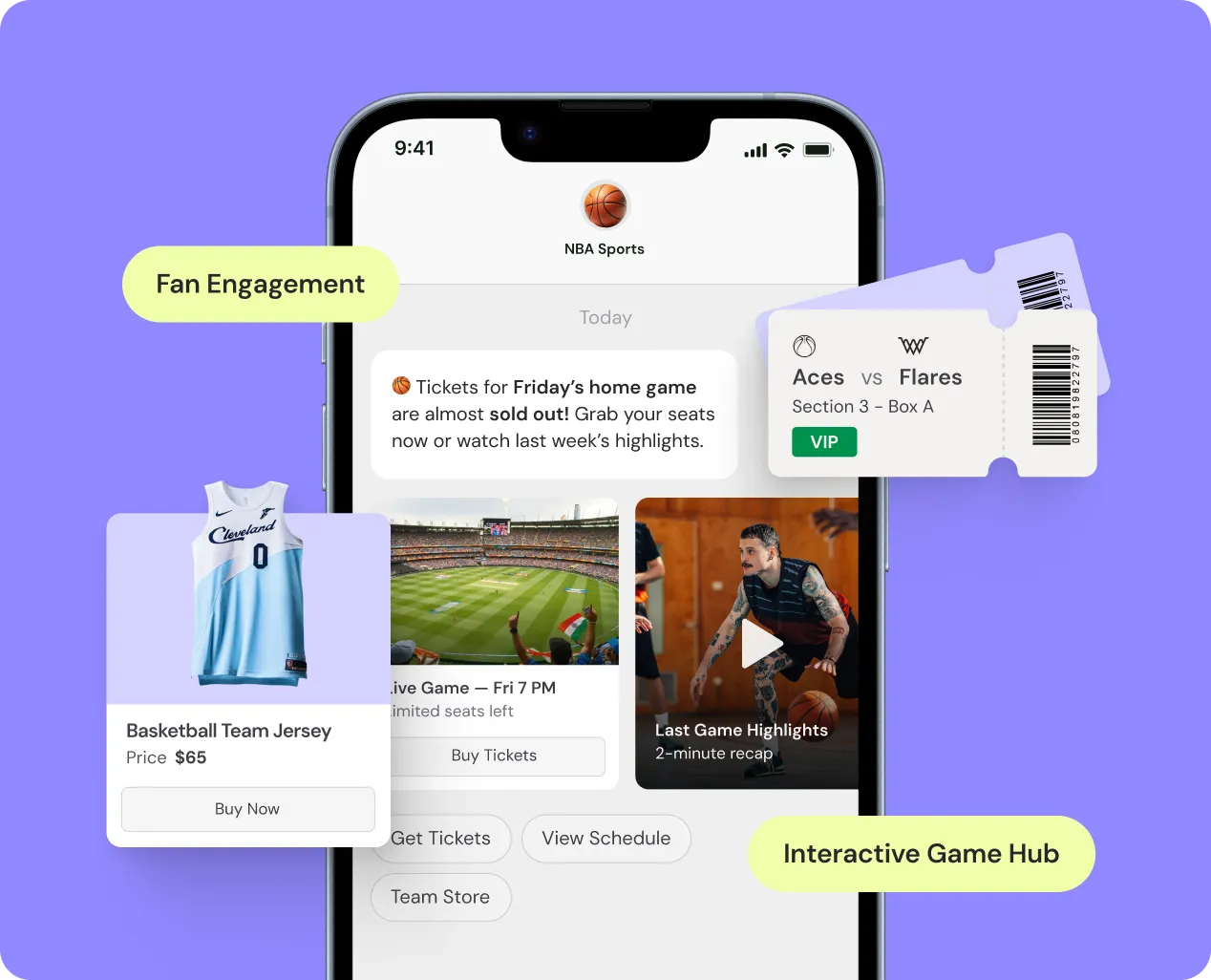
Ticket Sales & Game Day Offers
Interactive ticketing journeys with seat selection, live pricing, and one-tap purchase

Live Event Updates
Instant score updates, weather alerts, and push-to-calendar game schedules

Merchandise & Concessions
In-stadium ordering with product carousels and mobile checkout
Health & Wellness Services

Prescription Refill Reminders
Automated notifications with one-tap pharmacy contact or refill requests

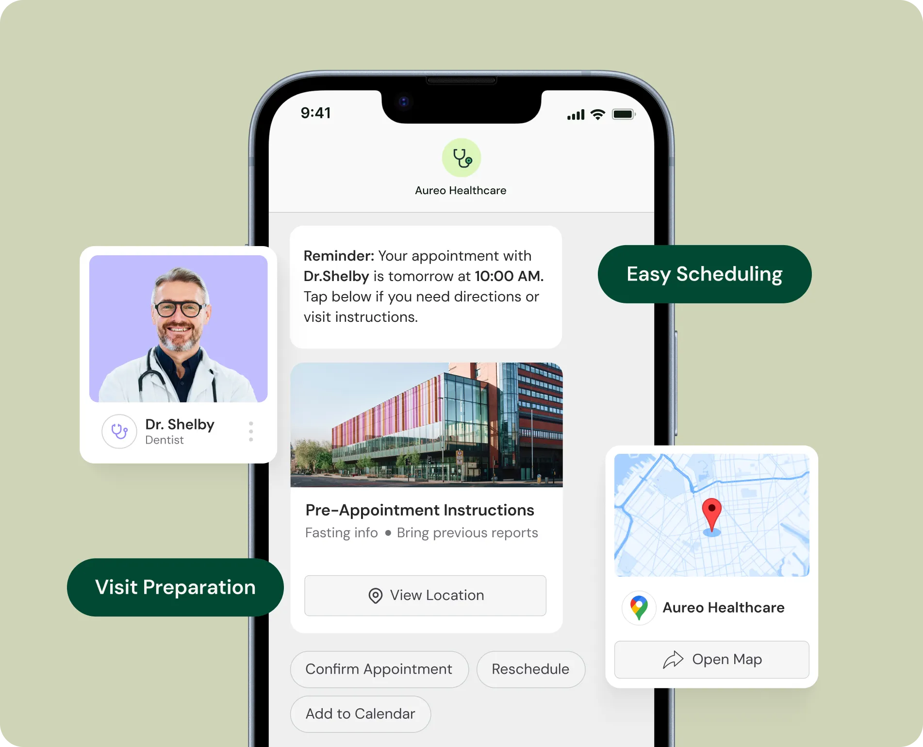
Pre-Appointment Instructions
Send preparation guidelines with visual aids and lab location maps

Test Results & Follow-Up
Secure notifications when results are ready with portal access buttons
Restaurants

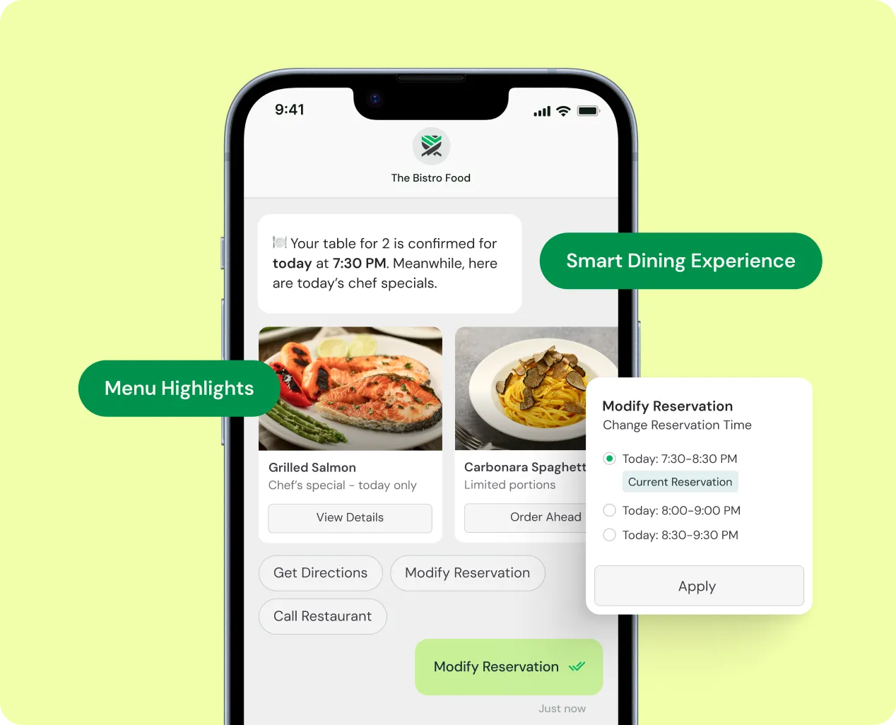
Waitlist Management
Real-time queue updates with estimated wait times and arrival confirmations

Daily Specials & Promotions
Time-sensitive offers sent at optimal ordering times (11 AM, 5 PM)

Loyalty & Rewards
Points updates, free item notifications, and birthday rewards with mobile redemption


How It Works
Three pillars. One promise: Your messages get delivered, get opened, and get results.
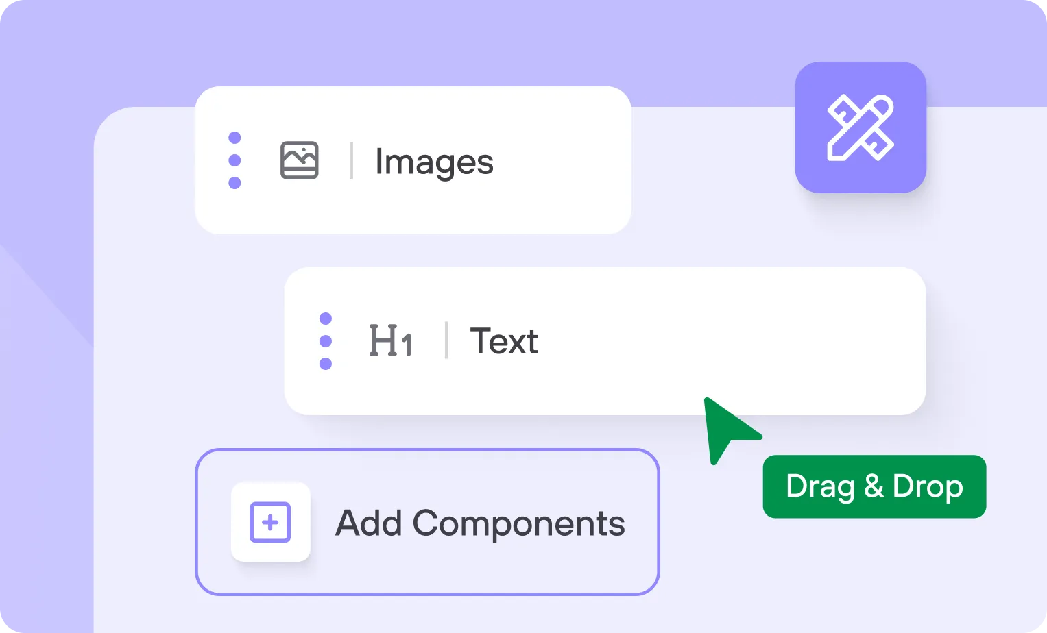
Create
Drag and drop your way to interactive campaigns with rich media, carousels, buttons, and conversational flows.
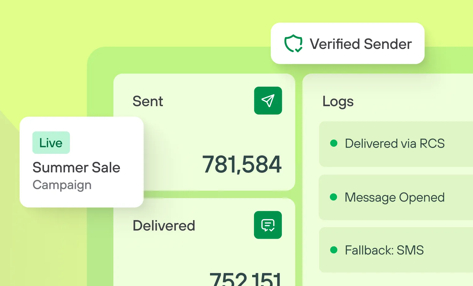
Cloud
Verified branding. Automatic fallbacks. Media hosting. Analytics that matter.
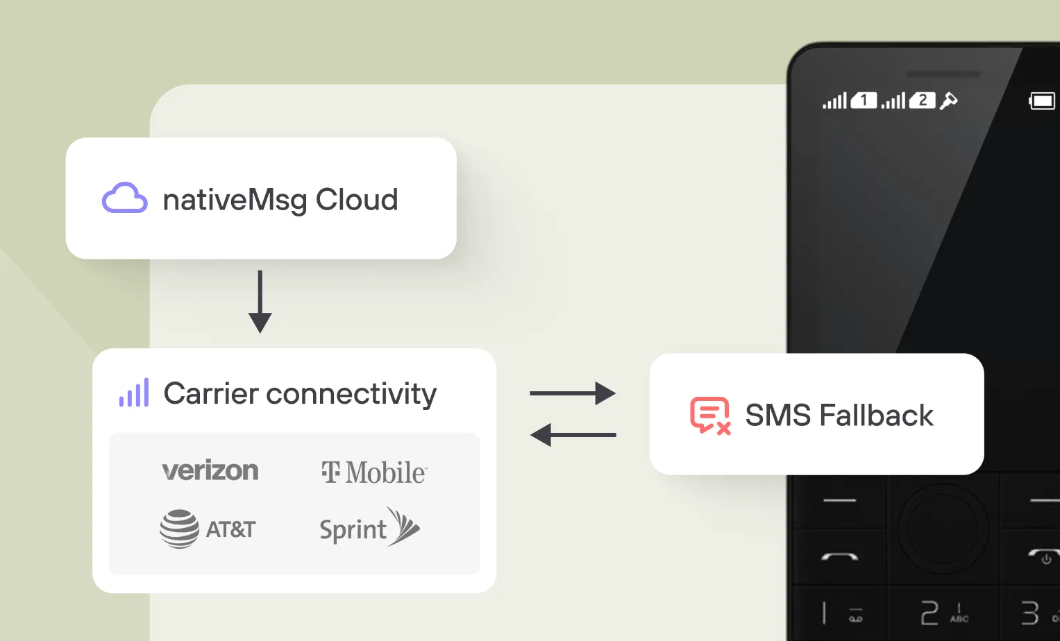
Connect
Direct carrier partnerships. Real-time device detection. Automatic fallback when RCS isn't supported.

No-Code Tools
Templates, drag-and-drop, A/B testing

Developer APIs
REST API, webhooks, integrations, triggers

Analytics
Tracking, conversion attribution, data export

Rich Media
Images, videos, audio, PDFs up to 100MB
Integrations
Three paths to integration
Hit engagement metrics. Sell more products. Cut support costs.
Platform Integration
Trigger campaigns from your existing tools
API Integration
Full REST API, webhooks, SDKs available
Data Export
Stream events to your warehouse in real-time

Security
Know that your messages are always secure and safe
Enterprise-Grade Security
That adheres to industry best practices and compliance standards.
Client prompts & data are never used for training
Completely isolated firm-specific data storage
Regularly audited & tested by third-party security specialists

